Tables
The VuiAdmin admin dashboard tables: search, filter, sorting, row actions, status badges and pagination.
Five tables on the tables screen, and they are five because that is how many shapes a real admin has: a list with avatars, a list with product images, a transaction log, a campaign list, and a compact variant.
What each one demonstrates
- Search, filtering the rows as you type
- A filter menu, for the column that has a small set of values
- Sorting, with the direction announced rather than only drawn
- Row actions, in a menu rather than three icons competing for the row's width
- Status badges, using the semantic tones so the same status is the same colour everywhere
- Pagination, with the numbered pages and a gap, where previous and next step through the numbers the pager actually drew rather than incrementing blindly
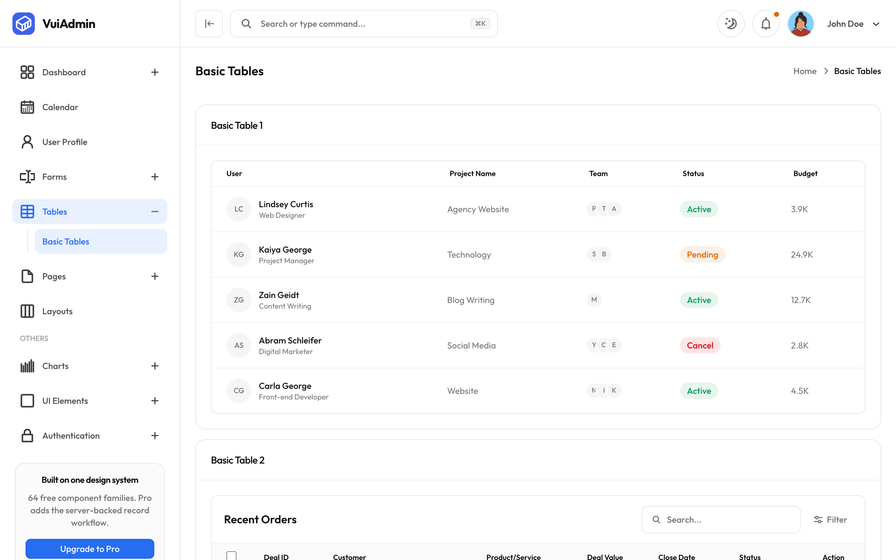
Avatars and images in a cell
The first column of a person table is an avatar with a monogram fallback underneath the image, so a
missing photograph degrades to initials rather than a broken-image icon. Product tables use the same
component with object-contain and a light plate, because a product photograph on a coloured
background looks like a mistake.
Where your data goes
Each table imports an array from a fixture file beside the screen. Replace the import, keep the shape, and the table works. The shape is a plain array of objects, with no wrapper type to satisfy.
// fixtures beside the screen
export const DEALS = [
  { id: "1", name: "Lindsey Curtis", role: "Web Designer", project: "Agency Website", status: "Active", budget: "3.9K" },
  // ...
];
The advanced table
Server-side pagination, column resizing and persisted column state are Pro. The free table holds its state in the component, which is the right answer up to a few hundred rows and the wrong one past that.