App layout
The VuiAdmin app shell: sidebar, header, and the six shell layouts you can switch between at runtime.
Every screen except the two authentication pages and the 404 renders inside one shell. The shell is the sidebar, the header, the content area and the footer, and it is one component per edition reading one shared description of what a shell is.
The parts
The sidebar is a two-group navigation with icons, collapsible parents and a submenu under each.
The current row is marked with aria-current="page" as well as a colour, because which page you are
on is information and not decoration. Below the navigation sits the promo card.
The header carries the sidebar toggle, a search field with a ⌘K hint, the theme switch, a
notifications menu and the account menu. On a narrow screen the search collapses to its icon.
The content area is a single column with a maximum width, so a dashboard on a very wide monitor does not stretch a table to two thousand pixels.
The footer is one line: the company, the year and the licence. It reads from environment variables, so shipping this template under your own name does not mean editing a component.
One navigation list, six editions
The sidebar's contents come from FREE_NAV in @viliha/vui-core, and the route list every edition
checks itself against is derived from it. That is why a nav item pointing at a page that does not exist
is a test failure rather than a link to a 404.
If you are adding your own screens, add them to the nav list and the route table together. Each edition's test suite holds the two against each other in both directions.
The six shell layouts
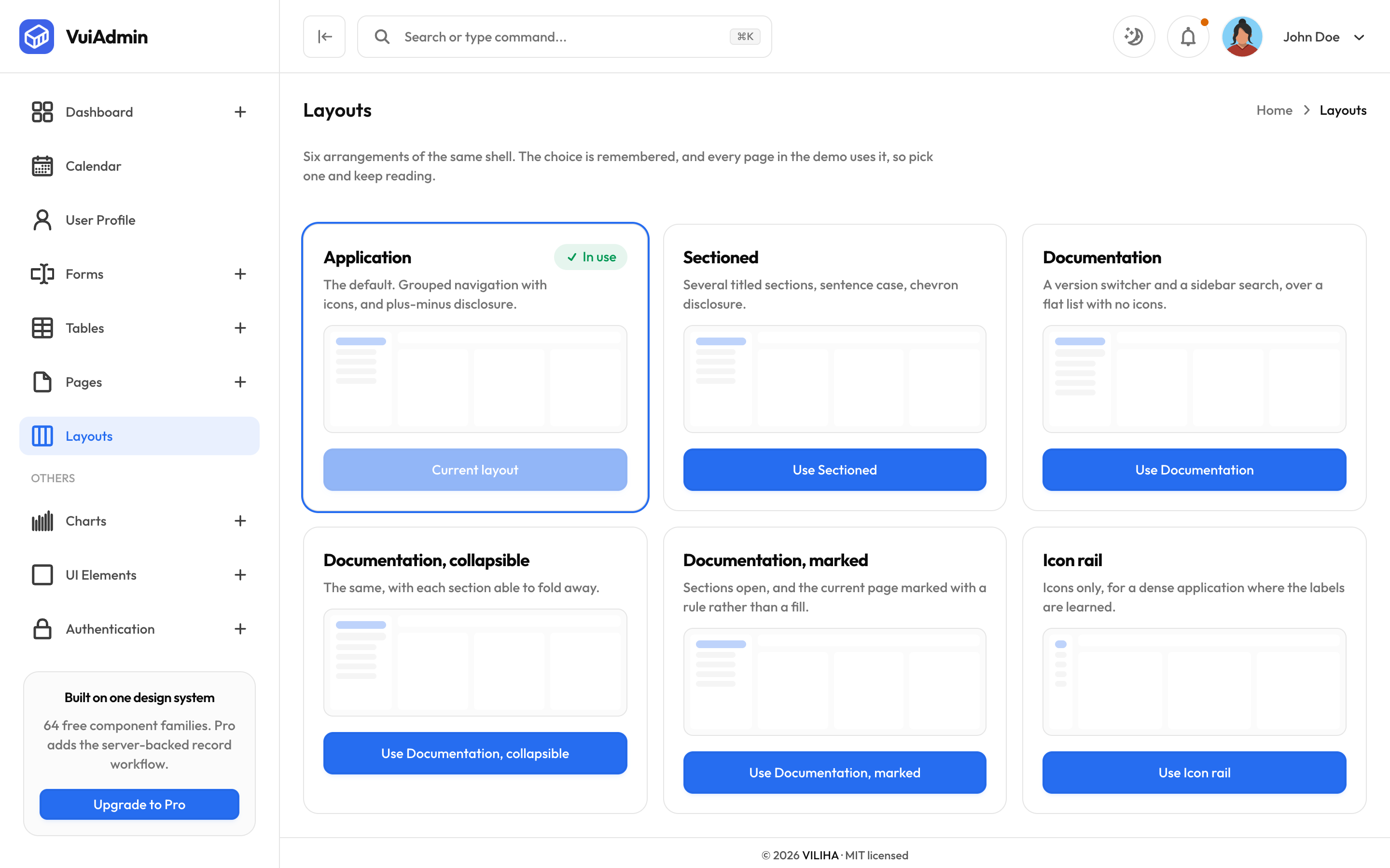
The /layouts screen is not a gallery. Picking a layout there changes the shell for the whole
application, and the choice is remembered, so you can send someone the demo in the arrangement you
were looking at.
| Layout | What it is for |
|---|---|
| Application | The default. Grouped navigation with icons, and plus-minus disclosure. |
| Sectioned | Several titled sections, sentence case, chevron disclosure. |
| Documentation | A version switcher and a sidebar search, over a flat list with no icons. |
| Documentation, collapsible | The same, with each section able to fold away. |
| Documentation, marked | Sections open, and the current page marked with a rule rather than a fill. |
| Icon rail | Icons only, for a dense application where the labels are learned. The submenus become flyouts. |
The rail is worth a look before you decide you do not need it. It is the arrangement that survives on a laptop screen when your application grows past fifteen destinations.
Screens that render outside the shell
Three, and each for a reason:
- Sign in and sign up, because a page for someone who has not signed in should not offer them navigation around it.
- The 404, because a not-found page wrapped in working navigation implies the navigation is trustworthy on a page that has just failed to resolve an address.