Forms and inputs
Every input type in the VuiAdmin admin dashboard template: text, select, multi-select, date, time, radio, checkbox, switch, file upload and password.
The form screen covers every input type the template ships, which is deliberate: a form page that demonstrates three of the eight controls you need is a form page you have to finish yourself.
What is there
| Control | Notes |
|---|---|
| Text input | With and without a placeholder, plus disabled and error states |
| Input group | A leading icon or a select, sharing one border with the field |
| Select | Keyboard navigable, with a searchable variant in Pro |
| Multi-select | Chips, removable, with a count when the list is long |
| Date picker | Type into it or pick from the calendar, both parse |
| Time picker | Hours, minutes and meridiem as three columns |
| Radio group and checkbox | Grouped, with a legend that screen readers reach |
| Switch | For settings that apply immediately, not for form submission |
| File upload | A styled control over the native input, so the platform keeps the file dialog |
| Password | With a reveal toggle, and the toggle is a real button |
| Textarea | Resizable, with a character hint |
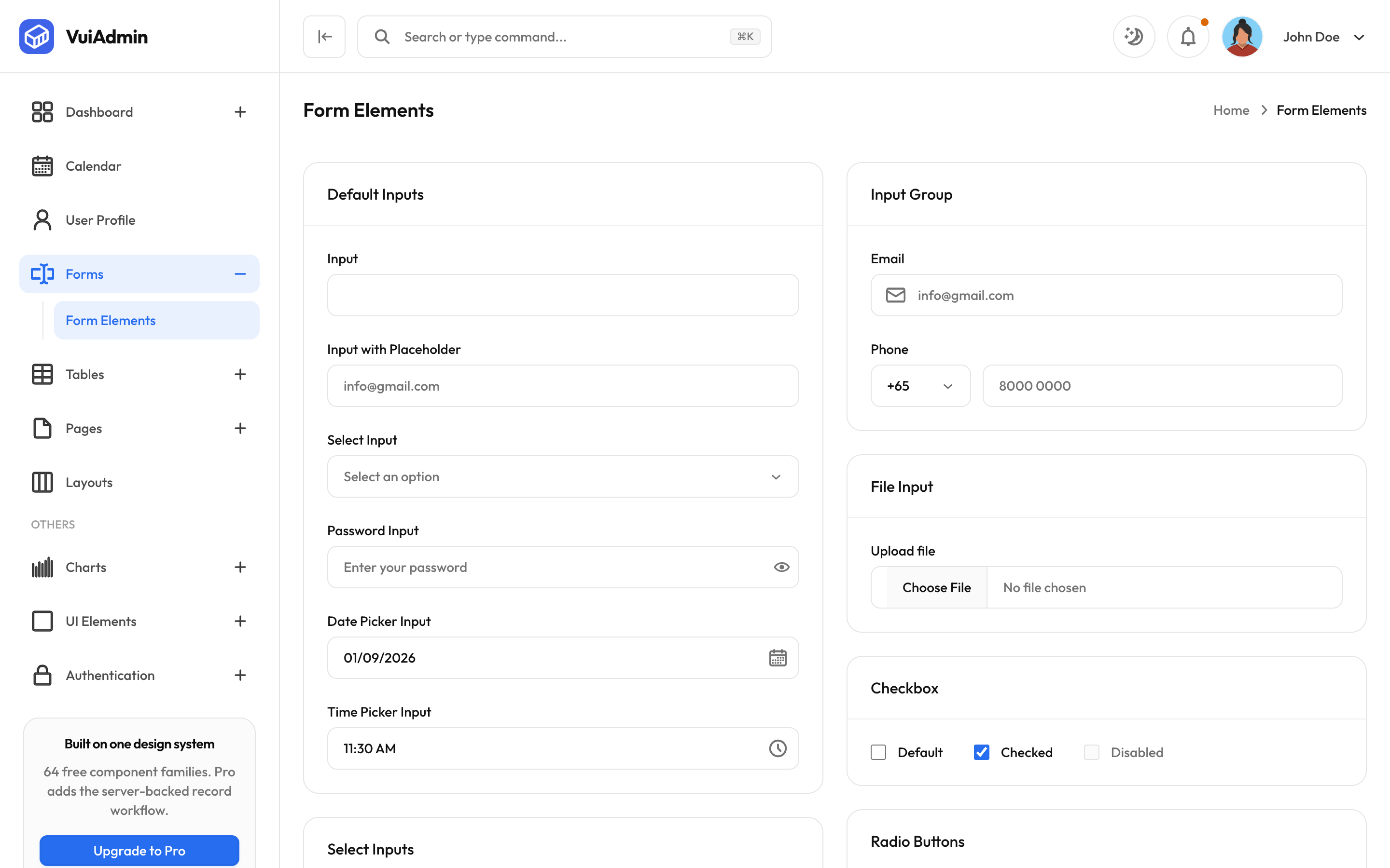
The date and time fields are typeable
This is the detail most templates skip. Both fields accept typing as well as picking, and the mask
that parses what you type lives in @viliha/vui-core so all six editions agree about what
03/04 means. A picker you can only click is a picker that is slower than the keyboard for anyone
entering more than one date.
Validation
The screens show the states (error, hint, disabled, required marker) but do not wire a validation library, because your choice of one is not ours to make. The required marker is a component rather than a literal asterisk, so it stays consistent and stays announced.
import { Input } from "@viliha/vui-react/input";
import { Label } from "@viliha/vui-react/label";

<Label htmlFor="email">Email <RequiredMark /></Label>
<Input id="email" type="email" aria-invalid={!!error} />
{error ? <p className="text-sm text-destructive">{error}</p> : null}