Dark mode
How dark mode works in the VuiAdmin admin dashboard template, and how to force one theme.
Dark mode is the dark class on <html>. The token file ships a .dark block that redefines
the same names, so nothing in a component knows which mode it is in.
Why a class and not a media query
Because a class can be toggled. A media query cannot be overridden by the person using your application, and "follow the system" is a preference rather than the only option. Being a class also means it needs no JavaScript to stay applied, only to toggle.
The toggle
The header's switch writes the class and stores the choice. In the HTML edition that is
data-vui-theme on a button and about ten lines in vui.js; in the others it is a small component.
One detail worth copying if you write your own: both icons are rendered and CSS picks, rather than choosing in JavaScript. Choosing in JavaScript means a statically exported page freezes whichever icon was correct at build time, which is how a demo ends up showing a moon while sitting in dark mode.
<MoonIcon className="size-5 dark:hidden" />
<SunIcon className="hidden size-5 dark:block" />
Forcing one theme
Set the class in the markup and delete the toggle:
<html class="dark">Making dark mode the default while still allowing a switch
Read the stored preference in the initialiser rather than in an effect, so the first paint is already correct. Reading it after mount means the wrong theme is visible for a frame, which on a dark-first application is a white flash.
What follows automatically
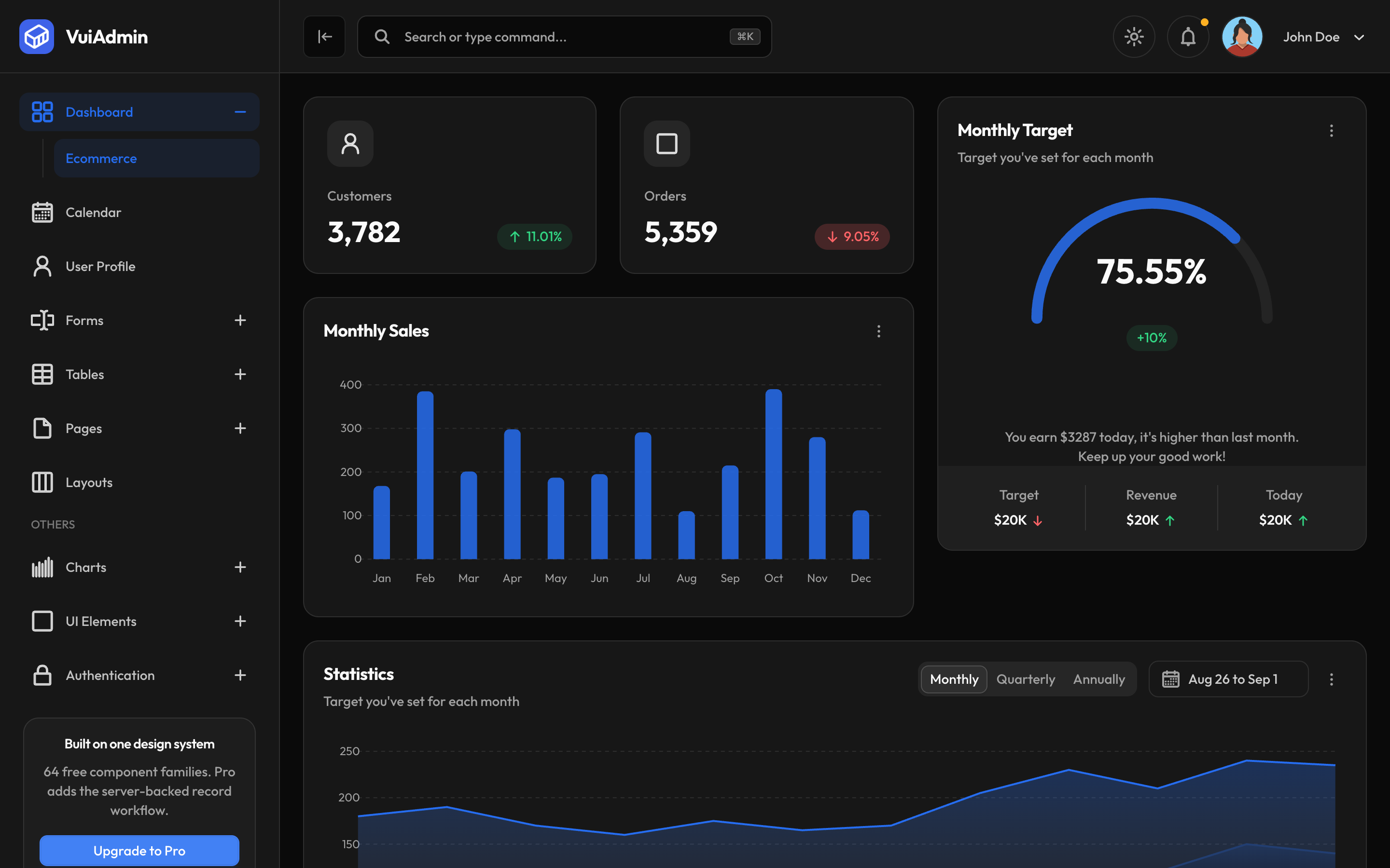
The charts, the world map and the calendar all read tokens, so they invert with everything else. If you add a component that hardcodes a colour, it will be the one thing that does not, and dark mode is where you will notice.